If you’ve ever walked into a grocery store and felt the frustration of not being able to find the brand you’ve always bought because they changed the look of their packaging, you already know why a brand guide is important.
When a brand, a unique color scheme, or a logo makes its way into the collective mind of the consumer, it can be hard to change course. Constant repetition of familiar graphical elements combined with fonts, styles and other themes make it easy for your company’s individuality to stand out from the competition.
If your company doesn’t have a brand guide, it needs one.
What is a Brand Guide, Exactly?
We’re glad you asked. Simply put, brand guides are sets of rules, formats, voicings and messaging styles that attempt to keep a brand message consistent across all media. This goes for print ads, radio spots, product packaging, and anything else that might contain a reference or suggestion to the brand.
The simplest style guides can include just the basics, like logos, color palettes, and specific vocabulary to be used in messaging. At this point, it’s important to distinguish design guides from writing guides, as the two are often conflated. Because of this, many companies unify their brand guides into one, an all-encompassing guide that covers everything.
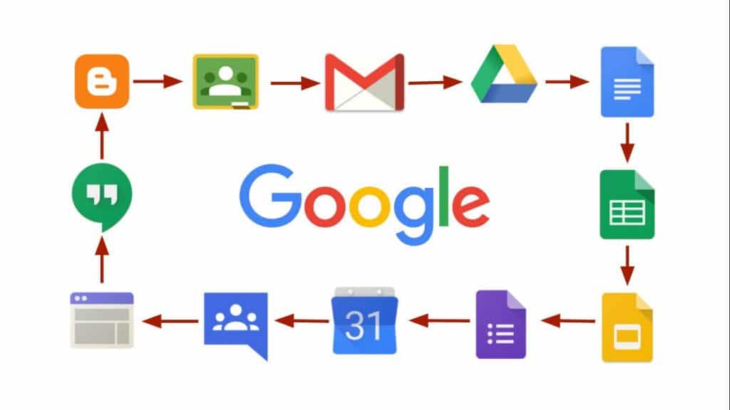
For now, we’re going to focus on design guides above writing guides, even though there can be some overlap between the two. As one of the best examples of a unified design style, let’s have a look at the iconography used in Google’s G Suite brands, like Gmail, Drive, Docs, and more:

One of the first things you should notice about the above graphic is that each icon has an intentionally simple structure with minimal depth. When you analyze these different G Suite icons, what you find is that shadowing or dimensional effects are only applied to about five to ten percent of the icon image at the most. Many of the icons remain in 2D for the express purpose of maintaining the brand presentation at lower resolutions. Genius!
Another key feature of these different G Suite design style is their use of the same four colors that are found in the Google logo itself: blue, red, yellow/orange, and green. This wasn’t done on accident: Google wants to be sure that when you see this specific set of colors, you think, “Aha! Google.” And, it works.
Time to Act
Perhaps you’ve realized that your company needs a brand guide of its own. Now that you know the basics of why they’re used, it’s time to start thinking about what to include in your guide. Think about fonts, graphics, color tones, and overall impression. What is the emotional response you want your brand to elicit? What styles, themes, or templates might be best to achieve this?
Want yet more ways to up the amplitude on your digital marketing? Contact Sympler today, and let’s forge forward, together.
CLICK HERE FOR A FREE SEO AUDIT


